Side Panel Grid
Grid Structure
Our grid includes a flexbox grid with a 4-column layout. The width of the grid is a fixed value.
This is how the grid works:
- Containers allow you to center your content within DroneDeploy's app side panel. It also keeps all your code within scope of the container.
- Rows are placed inside a container. Rows allow you to align content horizontally.
- Columns are placed inside a row. Columns allow you to set the number of columns that will compose your layout within a row.
The grid is composed of three major components a container > row > 4 columns.
4 Column Grid

Here is an example of how you would structure 4 columns within within a row on your HTML.
<div class="container">
  <div class="row">
    <div class="col-1">1</div>
    <div class="col-1">2</div>
    <div class="col-1">3</div>
    <div class="col-1">4</div>
  </div>
</div>
Layouts with Diverse Column Widths

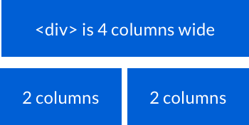
Example of structuring your HTML to create rows with diverse column widths.
<div class="container">

  <div class="row">
    <div class="col-4"><div> is 4 columns wide</div>
  </div>

  <div class="row">
    <div class="col-2">2 columns</div>
    <div class="col-2">2 columns</div>
  </div>
</div>
